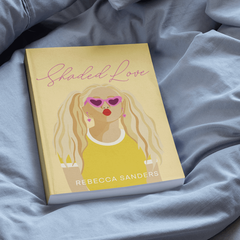
Introduction: Understanding Typography
Fonts do more than shape letters. They guide the eye, set the mood, and make printed books easy or hard to read. When you print your book with Mixam, the right font can help your message come through clearly and professionally.
This guide will help you understand what makes a font easy to read in print and how to pick the best style for your content. We’ll also show you how to find and use fonts that work perfectly for printing. By the end, you’ll know exactly how to choose fonts that bring your message to life and make your final printed piece look professional and polished.
Factors Determining Font Readability
Spacing Considerations
Print-ready fonts should have clear and consistent spacing between letters (tracking) and between words. When characters are too close together, they can be hard to read and make reading tiring. On the other hand, if the spacing is too wide, it can cause a disjointed reading experience. Balanced spacing keeps the reader’s focus steady and reduces eye strain. It also ensures that text looks clean and professional when printed, especially important in book layouts with long paragraphs or columns.
The Role of Letter Height
The height of lowercase letters, also known as x-height, plays a key role in a font's readability. A larger x-height means letters like “a,” “e,” and “o” take up more vertical space, making them easier to identify at a glance. This improves legibility, especially at smaller font sizes, which is critical for text-heavy books. Fonts with low x-height might look elegant on-screen, but they can be harder to read when printed, especially under low lighting or on textured paper. What seems stylish and balanced in digital previews can lose clarity in a printed book, so always test fonts in print before choosing your layout.
Impact of Serif Size
Serifs are the small strokes at the ends of letterforms in many traditional typefaces. They help guide the eye along lines of text, which is why serif fonts have long been used for printed books. Fonts with fine, subtle serifs tend to support readability, while fonts with oversized or creative serifs may interfere with the flow of reading and appear too ornamental. For print, it's best to stick with serifs that add structure without overpowering the letters themselves.
Choosing Fonts that Complement Content
Matching Fonts To Book Type
Fonts are visual cues that tell readers what kind of content to expect. Like a biography or historical novel, a formal book often benefits from a classic serif font that signals tradition and seriousness. In contrast, a modern self-help guide or tech manual may feel more approachable with a clean, sans serif typeface. Your font choice should support the tone and purpose of your writing, helping readers connect with the message.
Mixam's Top Font Recommendations
Best Fonts for Body Text
The main text of your book should be easy on the eyes during long reading sessions. These fonts are popular choices because they work well in long blocks of text and reproduce cleanly in print. Fonts like:
- Garamond – soft, classic, and ideal for immersive reading
- Minion Pro – balanced proportions with high legibility
- Baskerville – formal and crisp, suitable for professional or academic tone
- Georgia – perfect for both screen and print, great for mixed media
Ideal Fonts for Headings and Subheadings
Headings help readers navigate your book. Pairing these fonts carefully with your body text maintains visual harmony throughout the book. Choosing the right font for them creates structure and interest:
- Futura – a modern font with strong geometric shapes
- Franklin Gothic – bold and highly legible, ideal for clear emphasis
- Montserrat – clean lines and great contrast with serif body fonts
- Playfair Display – adds a touch of sophistication without compromising readability
Fonts for Print: Compatibility and Style
Too many fonts can make a book look unstructured and unprofessional. Stick to two or three fonts: one for body text, one for headings, and an optional accent font for special elements. They should share similar proportions and a consistent style.
Most importantly, ensure your chosen fonts are print-compatible, not web fonts. Web fonts may look fine in digital previews but can cause printing errors or unclear text on paper. Web fonts are for screens only and may cause problems that won’t be visible in your Virtual Preview or Downloadable Proof. For more information, visit the 'Printing Fonts' section on our Print File Setup Guide.
Also, embed all fonts in your final print file to avoid replacement or display errors during printing.
Use our Design Online tool to create files with fonts that are fully print-ready and safe to use in your project.
Free Fonts for Print
Choosing the right font is not just about style, it’s also about licensing and practicality. Free and paid fonts each have their place in high-quality book printing, but you need to make sure they’re suitable for commercial use and print-ready.
Free vs. Paid Font Options
There are many free fonts available that can be used for personal and commercial projects. However, it’s essential to review each font’s licensing terms to avoid unexpected issues in your final print file.
Free font options include:
- Google Fonts – Offers a large collection of professional typefaces for free, including many suitable for printed books. You can explore their Fonts Knowledge and FAQ for clear licensing information.
- Adobe Fonts – Included with Creative Cloud subscriptions, Adobe Fonts features a curated selection of typefaces for personal and commercial use. Their licensing support page helps you navigate any questions.
- Font Bundles – Offers both free and paid fonts, with clear licensing through a simple traffic light system on their license page.
- DaFont – A trusted resource for free fonts. Filter your search to show only '100% free' options for personal and commercial use, and always check the font's profile for licensing details.
- 1001 Free Fonts – Showcases a wide range of typefaces. Licensing information is listed with each font, and you can preview them in your chosen settings for brand consistency.
- 1001 Fonts – Over 500 pages of free fonts across categories like 'Decade' and 'Attitude.' Click the red price tag icon to see which fonts are cleared for commercial use.
- FontSpace – This platform moderates all fonts and highlights those that are licensed for commercial use, making it easier to find reliable typefaces.
Mixam's Top Typography Printing Tips
- Font Size: Use at least 10–12 pt size for body text. Consistent font sizes make your book look professional and are easier to read in print.
- Line Spacing: Aim for 1.5 or double-spacing between lines for a clear and readable layout.
- Margins: Keep margins consistent on all pages for a clean, balanced look.
- Avoid Thin White Characters on Dark Backgrounds: Thin white text can fill in or blur when printed over dark backgrounds. Use thicker fonts or choose a different colour for better readability.
- For Black Text: Use 100% K (pure black) without Cyan, Magenta, or Yellow for sharp and crisp printed text.
- Avoid Type 1 Fonts: These fonts are no longer supported by Adobe. For more information, visit Adobe’s guide on PostScript Type 1 Font End of Support.
FAQs
What is the font used in books?
Common fonts include Garamond, Times New Roman, Minion Pro, and Baskerville. These fonts are chosen for clarity and are an ode to tradition.
Which font is best for writing books?
Use Garamond or Minion Pro for long texts. They're easy on the eye and ensure high-quality printing.
What's the best font for text-heavy books?
Georgia, Palatino, and Garamond are known for readability, especially in print.
Conclusion
Choosing the right font makes your book easier to read and more professional. Whether you're designing a novel, photo book, or guide, font choices matter, and Mixam is here to help.
To dive deeper into book design and layout, our free Book Printing Guide offers step-by-step insights on everything from file setup to book promotion tips. And once your book is complete, take a look at our PrintLink Guide to learn how you can sell your work on demand, without upfront costs or inventory.
Main Image Credit: Freepik